


According to Zendesk, “70% of consumers spend more with companies that offer fluid, personalized and seamless customer experiences.” This explains why companies across sectors are investing in user experience (UX) to create engaging and memorable digital products that attract, reward and retain customers. Experienced UX designers rightly apply core principles of design and develop products that are functional, desirable, accessible, credible and usable. They concentrate their efforts on designing a pleasing and rewarding path for a product, but they should also pay attention to empty states. What are these, and how can they support business goals and enhance user experience? Read on to find out.
Empty states – what are they and what can they do?
Put simply, an empty state, sometimes referred to as a ‘blank state’, is an empty screen, or a time in a user’s experience with a product when nothing is displayed (nothing refers to data). Empty states can occur in several places, depending on how your digital product displays data, including dashboards, data tables, tiles, pages and side panels. This article will focus on three of the most common types of empty states and offer guidelines about when, and how, to use them.
Empty states are a great way to keep users informed, supported and on the right paths to reach their goals. Regardless of the type of empty state implemented, an experienced UX design team can use this moment in an app to form a meaningful connection with a user. For one thing, it is an opportunity to personalize content, as data on previous user preferences and past behavior could be reflected by suggesting similar content or a customized message.
Additionally, empty states, beyond being an opportunity to provide instructional content (more on that below), are also a way to enhance visual interest, as illustrations, animations and other images can boost user engagement and generate a positive impression. The visual elements could be about the specific digital product a user is engaging in, or be an aspect of a company’s branding strategy, raising brand awareness or conveying messaging that supports a brand’s values and goals.
#1 First-time use empty states
The most common type of empty state, otherwise known as no data empty states, first-time use occurs when data has not yet been provided by a user. In other words, a user engages with a product or service when there is still nothing to show. This space is visible while a product is waiting to be populated with data, and often provides instructions to a user about what needs to be done to continue a process. Here is an example from Instagram:

The goal of this empty state is to help users understand what will be available on the page when data has been added or what to expect if they have added data. Using this type of empty state is quite common for simple processes, where bite-sized pieces of information are desired.
#2 User action empty states
These empty states provide feedback based on the actions a user has taken. This could be anything from displaying a message that shows no search results found for a given query to confirmation of a successful action a user has completed in a process. For example, a message like this clearly lets a user know that a reservation has been successfully made:

While this image conveys positive feedback (the user should be happy to learn that the desired goal has been achieved), user action empty states can also be used to provide further instructions, while indicating, for example, how a user can adjust search terms or filters to accomplish a task. Displaying this information is important as it means users do not have to wonder what happened after they clicked ‘search’, and nothing appeared.
#3 Error management empty states
Perhaps the first image that comes to mind when thinking about errors when using a digital product is ‘404’, which is indeed a great example of this type of empty state. Error management empty states are used when there are issues regarding permissions (a user does not have permission to view certain data) and systems (a user tried to preview a file type which is not supported), as well as when configuration is required. Overall, these types of messages are designed to explain to a user that something has gone wrong and that some amount of additional intervention, or troubleshooting, is required. In an ideal scenario, a user should understand that a problem has occurred and receive information about how to correct this issue. A common example most people have come across in their lives is this:

This well-known image from Google appears when a user doesn‘t have an internet connection and offers possible solutions to the problem But the UX designers behind this empty state went one step further – by adding a gaming element to this empty state which rewards users with an enjoyable experience and offsets the disappointment that comes with an otherwise negative message about a lack of internet service.
Alternatives to empty states
There are other ways to achieve the goals of empty spaces. One strategy worth considering is onboarding, which is actually an extension of an empty state, in that an empty state can begin an onboarding sequence, which will then carry users through a process.
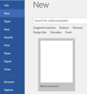
Another option is what’s called starter content, which is pre-built content that enables users to begin using an app quickly and easily. Starter content often takes the form of pre-configured kits and workflows, like in this example from Microsoft Word:
Designing empty states
When designed according to anticipated user needs and expectations, empty states can be an integral part of a seamless user experience, as they provide an appropriate amount of information, in the right context, to help users continue their journeys in an efficient, and effective, manner.
As with all aspects of design, UX specialists should keep the perspectives of potential users front and center. This means asking questions like:
– What will pages, tables, panels and other visual elements look like without additional content?
– What are the possible steps users could take to deal with a certain situation?
– Would it be possible to display useful content, or create content to address different scenarios?
– How can an outcome be turned into an experience that is compelling and useful?
Answering these questions will go a long way toward creating an empty space that boosts user engagement and creates a memorable experience.

Empty space design best practices
Do:
- Be precise about what will be available in a given space if data is placed there
- Minimize the amount of text so that users read it easily and take action
- Guide users to direct links in text or a button if there is an actionable next step
- Describe situations with clear, concise language
- Respect users by using an appropriate tone of voice
Don’t:
- Provide multiple options in one empty state (focus on the most important message)
- Use niche terminology or product jargon that may confuse users
- Include irrelevant content
- Lead users into a dead end
Far from being a ‘missing element’ in a digital product, empty states are a unique opportunity to educate, help and guide users on their journeys, and as such, are a vital part of a product’s digital experience. To make the most of this tool, companies need to work with a proven UX design team that embraces diverse design strategies to create attractive, functional and engaging designs. That’s why companies across sectors and markets turn to Software Mind, whose UX experts are committed to understanding the business goals of a product and empathizing with users’ needs. If you’d like to learn more about partnering with a UX team that is user-centric, creative and experienced in a wide array of design techniques, get in touch by filling out the form below.

About the authorSoftware Mind
Software Mind provides companies with autonomous development teams who manage software life cycles from ideation to release and beyond. For over 25 years we’ve been enriching organizations with the talent they need to boost scalability, drive dynamic growth and bring disruptive ideas to life. Our top-notch engineering teams combine ownership with leading technologies, including cloud, AI, data science and embedded software to accelerate digital transformations and boost software delivery. A culture that embraces openness, craves more and acts with respect enables our bold and passionate people to create evolutive solutions that support scale-ups, unicorns and enterprise-level companies around the world.